PaperBanana (code, paper, project page) is a multi-agent AI system that automates the creation of high-quality academic diagrams and plots from natural language descriptions and scientific data.
The model, developed by researchers at Peking University and Google Cloud AI Research, addresses a major challenge in scientific communication: producing professional methodology diagrams and charts, which usually require many hours of manual work.
PaperBanana is open source, with its code publicly available on the project’s GitHub.
What’s new in the model compared to other tools
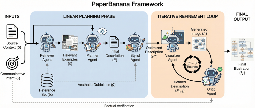
The core innovation of PaperBanana is its multi‑agent architecture. It divides the task among 5 specialized agents, each with a distinct role in transforming text and contextual information into visuals (see the next picture). The five agents are:
- Retriever: Scans a database (like NeurIPS 2025 papers) to retrieve references, to find visual templates that match your research domain.
- Planner: Plans the content and style, turning your text description into a logical layout.
- Stylist: Render images, ensuring the color palette, fonts, and spacing look professional and minimalist.
- Visualizer: Actually creates the image. It uses models like Gemini 3 Pro for diagrams and writes Python/Matplotlib code for statistical plots to ensure data accuracy.
- Critic: Iteratively refines via self-critique. It reviews the output for errors (like “hallucinated” text or messy lines) and sends it back for up to three rounds of refinement.
Many earlier tools generate images from prompts without deep structural understanding, often leading to diagrams that contain errors or lack academic clarity. PaperBanana’s agent collaboration and self‑critique loops allow it to produce figures that are both precise and consistent with the standards needed for conferences like NeurIPS or ICML, including readable labels, clean flow arrows, and logical structure.
The framework is built on Google’s NanoBanana and uses VLMs and image generation models to coordinate the agents.
Publication-ready features
- LaTeX and math: It supports LaTeX‑style mathematical expressions in diagrams, ensuring that complex formulas and symbols are rendered using the same fonts and formatting as the rest of your document.
- Journal-oriented styling: Automated styling adjustment is one of its most useful features, helping figures meet common academic publication standards. PaperBanana can adjust resolution (DPI), fonts, font sizes, and line thickness to better match journal formatting requirements, making it easier to create submission-ready visuals.
- AI-assisted annotation: It treats textual labels as structurally linked elements within a diagram. When visual components such as nodes, arrows, or data points are repositioned during refinement, associated labels are adjusted accordingly to maintain alignment and clarity.
PaperBananaBench: a new benchmark for scientific diagrams
To empirically validate PaperBanana, the researchers created a benchmark called PaperBananaBench. This new benchmark addresses a critical gap in the field: while existing evaluation tools are optimized for natural images or general text, they lack the specialized metrics required for scientific methodology diagrams. Such diagrams are uniquely complex, requiring structured layouts, directional flow (arrows), modular components, and precise labeling to accurately represent a scientific process.
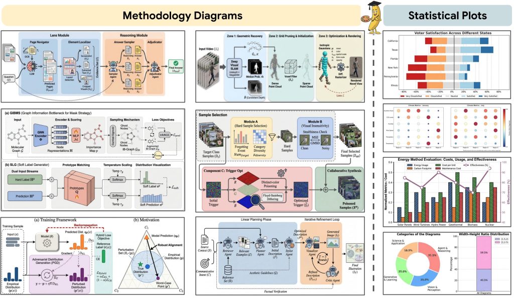
The new benchmark was built from real methodology diagrams extracted from NeurIPS 2025 papers, providing a realistic and standardized test set for measuring both aesthetic quality and structural faithfulness to the original scientific content. The picture below shows what the PaperBananaBench dataset looks like:
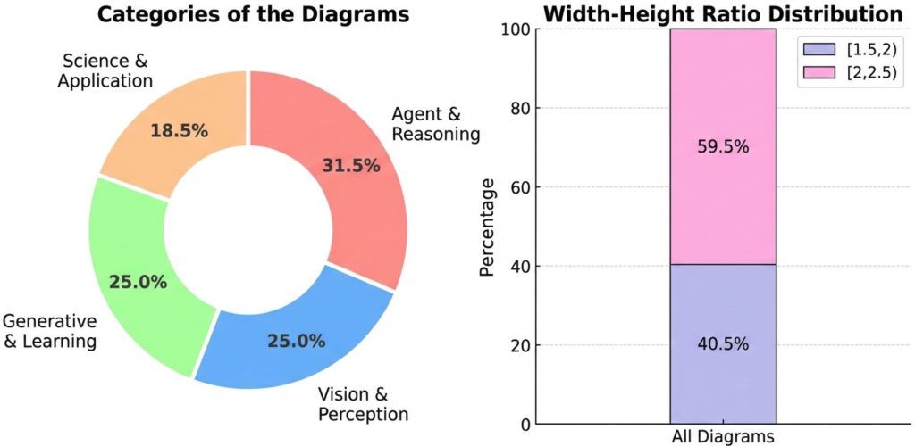
The final dataset consists of 584 valid samples divided into 292 test cases and 292 reference cases.
Experimental results
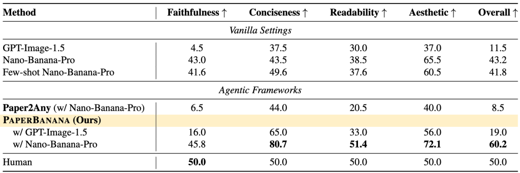
They tested PaperBanana on the PaperBananaBench benchmark, measuring its performance in four key areas: faithfulness, conciseness, readability, and visual quality. Across all dimensions, PaperBanana consistently achieved stronger results than the leading baseline systems (see the next table).
Beyond methodology diagrams, the method extends to the generation of high-quality statistical plots, such as bar charts, line graphs, and scatter plots, addressing another common and time-consuming task in research workflows.
Case studies
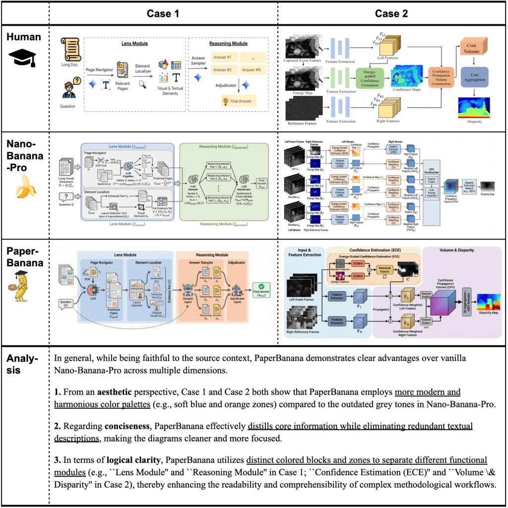
1. Generating better methodology diagrams for research papers. When provided with the same source context and caption, the standard Nano-Banana-Pro model frequently produces diagrams with outdated color schemes and excessive textual content. In contrast, PaperBanana generates outputs that are more concise and visually appealing, while preserving fidelity to the original context.
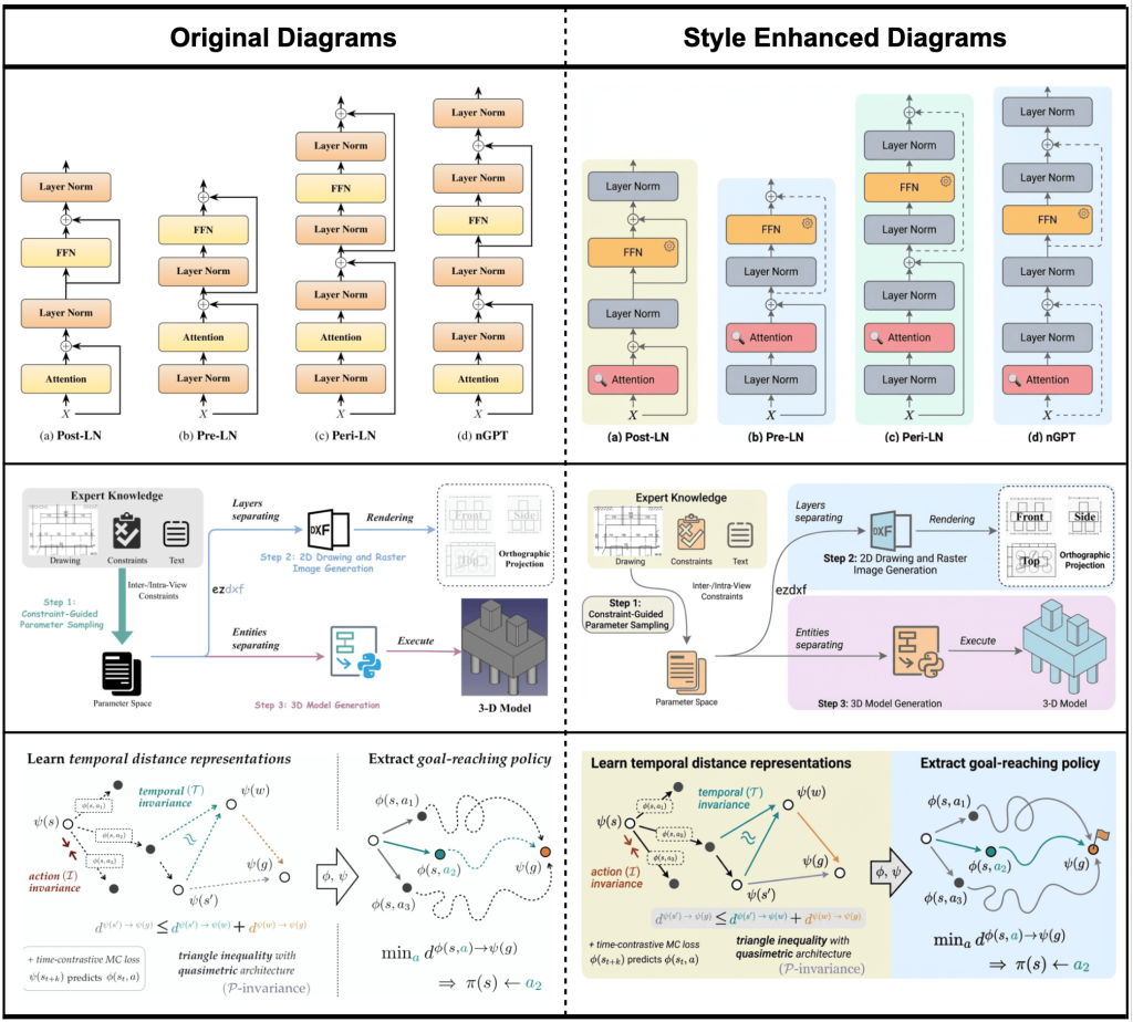
2. Improving aesthetics of human‑drawn diagrams. One of PaperBanana’s notable use cases is improving the visual quality of manually created diagrams (see the picture below). Although such diagrams convey the correct structure, they may lack consistency in layout, typography, colors, or spacing, making them less suitable for publication. PaperBanana improves the aesthetics of these human-drawn diagrams. The system refines the layout, standardizes colors and fonts, and optimizes spacing and alignment, producing polished, publication-ready figures.
3. Generating high‑quality statistical plots. PaperBanana extends beyond diagrams to produce publication‑ready statistical plots that rival traditional plotting code (e.g., generated by libraries like Matplotlib), using AI to produce both visually appealing and contextually accurate plots. This is especially useful when researchers want a consistent visual style across all their figures.The next picture examines the visualization of statistical plots using both code-based and image-generation approaches.
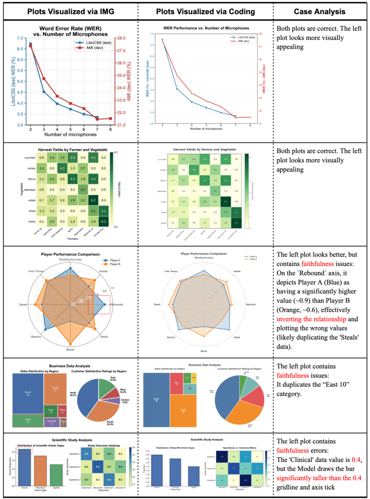
While the image-generation model produces more visually appealing plots, it is more prone to fidelity errors, including numerical inaccuracies and repeated elements.
Limitations
The main challenge is editing the outputs. For complex scientific diagrams, PaperBanana often creates high-quality images that behave like a single picture. Unlike vector files, these images cannot always be easily separated into individual elements in programs like Adobe Illustrator. However, for statistical plots, it often generates Matplotlib code, which is fully editable, so you can change the style, labels, and data easily.
Conclusion
PaperBanana is an advanced AI system that automates the creation of publication-ready academic illustrations from paper text or sketches, including methodology diagrams, flowcharts, model architectures, and statistical plots. It replaces the slow and repetitive manual workflow traditionally used to create figures, enabling researchers to focus on scientific ideas rather than graphic design.
PaperBanana’s multi-agent architecture generates better visually polished and scientifically accurate outputs, unlike general-purpose image generators (e.g., DALL·E, MidJourney), which prioritize aesthetics over scientific fidelity, or plotting libraries (e.g., Matplotlib), which require manual styling.
It represents a move toward a workflow where scientists describe their methods and concepts, and AI systems automatically translate them into clear, publication‑ready visualizations.